

Previously, I have written briefly about the years since the 2008 Financial Crisis (aka the Great Financial Crisis, or GFC), and how they represented not only a "lost" decade for the American economy, but also a "false" decade, where much if not all of the economic growth reported in the United States has been largely an illusion.
With the dramatic economic upheavals arising from the COVID-19 pandemic (more accurately known as the CCPVirus pandemic, as the virus and the pandemic come into the world courtesy of the Chinese Communist Party), the time has come to revisit that earlier analysis, and take a deeper look into the underlying data.
The Financial Clown World Of The Federal Reserve
Any serious discussion of the American economy must begin with that study in economic dysfunction known as the Federal Reserve System. More than a few investment professionals as well as economic observers have excoriated the Fed for its policy of deliberate asset price inflation:
Well, for the last 20 years mainly by extremely low interest rates and balance sheet expansion sprinkled with an enormous amount of jawboning. The principle effect: Asset price inflation.
It’s not a side effect, it’s the true mission. The Fed has been managing the economy via asset prices even though Jay Powell again insisted on saying the Fed is not targeting asset prices.
Even I have taken the Fed to task time and again for policies and pronouncements that are either ineffectual or intemperate:
Thus it is when the Federal Reserve's policy statements and forward guidances on interest rates are treated with scorn by financial markets, we should pay attention. When central banks around the world pursue interest rate policies that are demonstrably harmful to the world's banking systems, we should pay attention. When the Federal Reserve appears to talk out of both sides of its institutional mouth, we should pay attention.When Fed Chairman Jerome Powell precipitously trimmed interest rates in the fall of 2018, I pointed out that Powell was creating a bear stock market.
No wonder President Trump would like to fire him--Trump has been clamoring against the rate hikes, correctly predicting that the money supply shrinkage would precipitate a stock market collapse. Market turmoil and declining share prices are not the way to "...promote maximum employment, stable prices, and moderate long-term interest rates in the U.S. economy." By all appearances, Jerome Powell has been seriously derelict in his duty as Federal Reserve Chairman. If he were the Controller or CFO of any major US company, he would have been fired by now.Certainly, the willingness of the Federal Reserve to intervene arbitrarily and capriciously in financial markets produces numerous negative repercussions within those markets, chiefly by destroying pricing signals and realistic asset valuations.
Furthermore, given the strong relationship between the length of bear markets and that of recessions, a relationship discussed one month ago Bank of America concludes that "equities are either betting on a record short recession (despite forecasts for near the worst in history), or on the Fed buying equities, believing fundamentals don't matter."When the government (and the Fed is an extension of the US government, regardless of the insistence of some that it is a "private" entity) intervenes in any market, price distortion is not merely inevitable, but intended. It cannot be otherwise, for a government intervention is driven by a policy position of some kind rather than the traditional market forces of supply and demand.
A key problem comes from the way the Fed interprets its mission of "price stability". All too often this becomes viewed as a mandate to prevent prices from either rising too fast or from falling at all. As many observers (including myself) have pointed out, this is price distortion by definition, and can only lead to misallocations and market disequilibriums--i.e., asset bubbles:
Central banks’ seriously misguided attempts to defeat routine consumer price deflation is what fuels the destructive build up of unproductive debt and asset bubbles that eventually collapse.
Contrary to prevailing wisdom at the Federal Reserve, not only is there no empirical support for the notion that consumer price deflation is inherently "bad", there is no logical support for the premise that a little inflation is a good thing.
The one and only time inflation expectations matter is in a state of hyperinflation when it pays to buy nearly anything and barter it.This is where the Fed's market manipulations begin, and where sane economic policy and behavior end.
Regardless of how the Fed intervenes in markets, its policies invariably either increase or decrease the money supply. To understand why, we must first have a basic understanding of the role interest rates play in the broader economy.
At a macro economic level, the role of interest rates is to define the "cost of capital"--how much money one pays in order to borrow a set amount. In order for one person to be able to borrow money to spend, another person must forego spending in order to lend, which thus establishes the key dynamic between investment/savings and consumption/spending within financial markets. Interest rates therefore also define the cost of consumption as well as the "cost" of savings.
R* is the (unknowable) natural rate of interest that supports full employment and stable interest rates. In theory, if r<r*, consumption saving is preferable and the economy is contracting.
In an expansionary phase, prices and consumption are increasing. Because prices and investment opportunities are high, demand for money among consumers/businesses is high, and interest rates (r) increase alongside borrowing. When r rises to the rate of r*, consumption slows, earnings fall, and a recession ensues. R* falls as uncertainty and risk aversion grow. This is a “business cycle” recession.A key point to remember is that the "natural rate of interest" is itself a dynamic quanity, and will rise and fall in response to various market conditions.
A recession can also be caused by some external shock to the economy that produced further declines in r*. This is because r* is reactive to uncertainty with a strong negative correlation. The greater the uncertainty, the lower r* falls.
In recession, r falls as consumption remains low as long as it is greater than r*. Defaults accelerate the drop in r. With the passage of time, r* rises slowly as the uncertainty/risk aversion surrounding the shock and/or end of business cycle fades. However the longer firms go without earnings due to low consumption, the more defaults are realized and the more r drops. At some point, the combination of falling r and rising r* results in r <= r*. Once this happens, consumption/ investment picks up and the economy enters recovery.
In addition to accelerating declines in r, defaults experienced during recession also lower the cost of labor and capital goods as the resources of failed companies are returned to the economy. In addition, barriers to entry in certain industries fall as “old guard” firms go out of business. Thus, as the economy enters recovery, this combination of cheaper labor/capital goods and lower barriers to entry leads to strong business investment and increases growth potential during the ensuing expansion.This is the theory. Unfortunately, it has not been much of the reality within the United States since the creation of the Federal Reserve in 1913.
When faced with recession and declining consumption, the Fed pushes rates lower in an effort to spur both consumption and investment.
As the economy cools, the central bank lowers r in an attempt to spur consumption by forcing r<r*. Consumption increases in response, and recession/defaults are avoided. But business resources aren’t returned to the economy. Recovery will be less robust due to fewer relative attractive investment opportunities.
The inherent inefficiency of this process pushes resources to the sidelines, thus every interest rate manipulation inhibits full resource utilization, which is by definition market disequilibrium. The amount of money in circulation increases because fewer resources are in play. This, of course, is the classic definition of price inflation.
Raising interest rates reverses that dynamic, and thus squeezes money out of circulation, thereby producing price deflation.
During the Great Financial Crisis, the Fed found itself facing an unusual circumstance: The "natural rate" of interest had moved negative because of the magnitude of the shock produced by the collapsing subprime mortgage market. Unable to reduce interest rates below zero, the Fed resorted to "quantitative easing", or QE, in an effort to explicitly expand the money supply.
Now in 2008, a shock in the form of subprime mortgages hits the economy and uncertainty skyrockets. R* moves into negative territory as shown in a recent San Francisco Fed study. The Fed moves rates lower, but is constrained by the zero bound. In order to further “lower r", the Fed embarks on asset purchases during QE and is successful in spurring consumption, as evidenced by the strong correlation between increases in excess reserves and increases in M1. M1 is the most basic measure of money supply and includes essentially only cash and checking/demand bank accounts.
The theory is that for a good or service to be consumed, it must be paid for out of M1. Therefore, the increase in M1 following QE is a measure of the degree to which QE results in actual consumption.
QE was thus an effort to explicitly distort financial markets (and thus overall prices) by direct manipulation of the money supply previously manipulated only indirectly via interest rates.
The prevailing wisdom at the Fed and in conventional financial circles is that this policy was successful in preventing economic catastrophe. This wisdom is wrong. Far from preventing an economic disaster, it has caused one.
Money Supply Growth: Dollars For Everyone (At Least For Every Bank)
What follows is my own analysis of data obtained from the Federal Reserve, the Bureau Of Labor Statistics, and the stock markets themselves. Anyone wishing to review the raw data I am using may download the CSV files from here and here. Original source links for the actual data will be found at the end of this analysis.
To understand how QE is a bad idea, we must begin by noting how the money supply in the United States has grown over time. This chart shows the growth of the M1 money supply in the United States from January 1997 through March of 2020.

Note the dramatic increase in the rate of money supply growth in 2008 and 2009. This is what Quantitative Easing looks like.
However, this policy of monetary expansion had a curious outcome: inflation did not happen--at least, not within traditional consumer price metrics. Note what happens when the Consumer Price Index is overlaid:

Note on analytical technique: these graphs are overlaid by setting each data set to a baseline value, thus eliminating differences in scale and units of measurement, and focusing solely on relative changes.
Prior to 2008, the M1 money supply and the CPI more or less moved along similar trend lines. This is exactly what we expect to see, and it is exactly what stopped happening in 2008.
Where did the money go? Quite simply, the money went to the big banks and hedge funds--the engines of investment on Wall Street. We can see this in the convergence of money supply growth and stock market prices (represented by the Dow Jones Industrial Average and the S&P 500 index) that happened at the same time the CPI diverged from money supply growth.

As the chart clearly shows, before 2008 the stock markets moved independent of the money supply, but not after. In fact, if we zero in on events after 2008, we see that the M1 money supply imperfectly raised stock market asset prices, as the widening gulf between the M1 supply and the stock market indices indicates.

There are several conclusions we can immediately draw from these relationships:
- The Fed's mission to expand the money supply actually conceals deflationary forces within the stock market (and, by extension, throughout financial markets as a whole). If we rotated the graph clockwise around the inflection point in 2008 when the pace of M1 growth increased, so that the M1 was flat (meaning no money growth), we would be seeing a steady decline in stock market prices across the board.
- The decision to explicitly goose the money supply eliminated important pricing signals from the stock markets. Pricing dynamics which previously not only revealed the presence of asset bubbles and other market disequilbriums but also triggered their correction are suppressed by the constant influx of new money. The necessary phenomenon of "creative destruction" is suppressed.
- The monetary expansion produced asset price inflation only within the financial markets, not in the broader economy. The money thus created never got any farther than banks, hedge funds, and other investment vehicles that power most Wall Street activity. The lack of any appreciable rise in core consumer inflation proves this absolutely--the only way inflation could not result is if the money the Fed was printing never made it into broader circulation. Thus, while the M1 growth did spur "consumption" of a kind, it was all within financial markets--no one was buying more widgets (and no one was making more widgets).
- To the extent that stock market indices are taken as a barometer of the broader economy, the intimation is that there has been little or no economic growth in the United States since the Great Financial Crisis (much to the chagrin, no doubt, to supporters of Presidents Obama and Trump alike).
There are no solid indications of actual growth in the stock market (valuation shifts rather than simply inflationary price shifts) until 2017 and beyond.
The reader will note the extreme downturn in stock prices and the sudden uptick in the M1 money supply in 2020. There is only one word necessary to explain that particular part of the graph: CCPVirus. That is a practical consequence of the current pandemic and the Federal Reserve's responses to it thus far. While there is insufficient data to show a definitive return to the market deformations of 2008 and 2009, the movement of the graphs clearly indicate that history is about to repeat itself, and not in a good way.
If The Stock Market Was A Lie, What About The Rest Of The Economy?
Now we must turn our attention to the question of what impact these money supply manipulations have had on the broader economy.
The general benchmark of economic performance for a country is GDP (Gross Domestic Product). In theory it represents the value of all goods and services a country produces over time. How well it does that in reality is a matter of constant debate--and is something far beyond the scope of this discussion--but for our purposes, consideration of GDP will provide the consistent framework needed to assess economic impacts.
Because we are concerned with changes rather than specific levels and values, comparisons are all made using the same baselining technique employed above.
It is important to expound first on the distinction between nominal and "real" GDP. The basic GDP metric is always reported in a dollar quantity reflective of the money supply and overall price level for that period of time. However, because money supply, price levels, and the purchasing power of a dollar are constantly in a state of flux, changes to the nominal GDP levels are intrinsically misleading, because the base quantity of money involved is constantly changing.
To establish a rational basis for comparisons over time, we have to first convert the nominal GDP values into "real" values. This is done by restating fundamental price levels in constant terms. For this analysis, this restatement is accomplished by dividing the CPI for the base period by the CPI for each subsequent period, and then multiplying that against the nominal GDP value for each subsequent period. The result is the "Real GDP".
In my earlier analysis, I used the "Real GDP" data from the Federal Reserve, which was not only restated into constant dollars, but had an additional "GDP deflator" applied. In that analysis, I noted that the GDP deflator used by the Federal Reserve was at best an imperfect adjustment, and noted further interactions between the Real GDP data and the CPI.
Rather than use these figures, however, I am recalculating Real GDP independently and not applying a GDP deflator directly. As I am baselining everything, I am able to inspect the impact of price changes (represented as changes to the CPI) directly in each period, so that is what I will be doing here. This alternate method of analysis yields a more consistent result set, and my readings since that first analysis have persuaded me this is a better analytical approach.
I am using seasonally adjusted GDP data to smooth out the curves and avoid any artificial year-end anomalies in the data.
There are several references online for the maths of calculating Real GDP as well as GDP Deflators for those wishing further detail on how these numbers are ascertained.
When we arrive at a set of Real GDP values using a given base year, and compare that to the CPI over the same time frame, we see a curious relationship:

There is little surprise that CPI and GDP largely follow the same basic trend line. We must remember there are two ways GDP values can change: prices can change, or quantities of output can change. Thus, the two graphs are always somewhat linked.
Further, we can see that price level changes impact GDP even beyond the calculations necessary to achieve a "Real GDP" figure. Even after a baselining calculation, we see price levels continue to fluctuate, and thus they continue to impact GDP.
This also points to a relationship between the CPI and Real GDP graphs. Actual economic expansion--i.e., expansion in outputs rather than just prices--can only occur when the Real GDP graph is above the CPI graph. When Real GDP falls below the CPI curve, total output is declining.
By comparing the differentials between the two graphs, we can establish a metric for real economic growth over time.

Look closely at this graph. What it shows is that the Great Financial Crisis and the prefatory subprime mortgage collapse eliminated all real economic growth from 1997 forward. Even worse, the economy has not recovered to even 1997 levels even today.
We see a similar picture when we reset the base period to January 2008.

Relative to the beginning of 2008, we do see some growth in later years, although eliminating the full scope of economic contraction since 2008 does not happen until sometime around 2014, and the magnitude of cumulative economic growth beyond 2008 levels is minimal (and, note, about to be eliminated yet again by the current pandemic response).
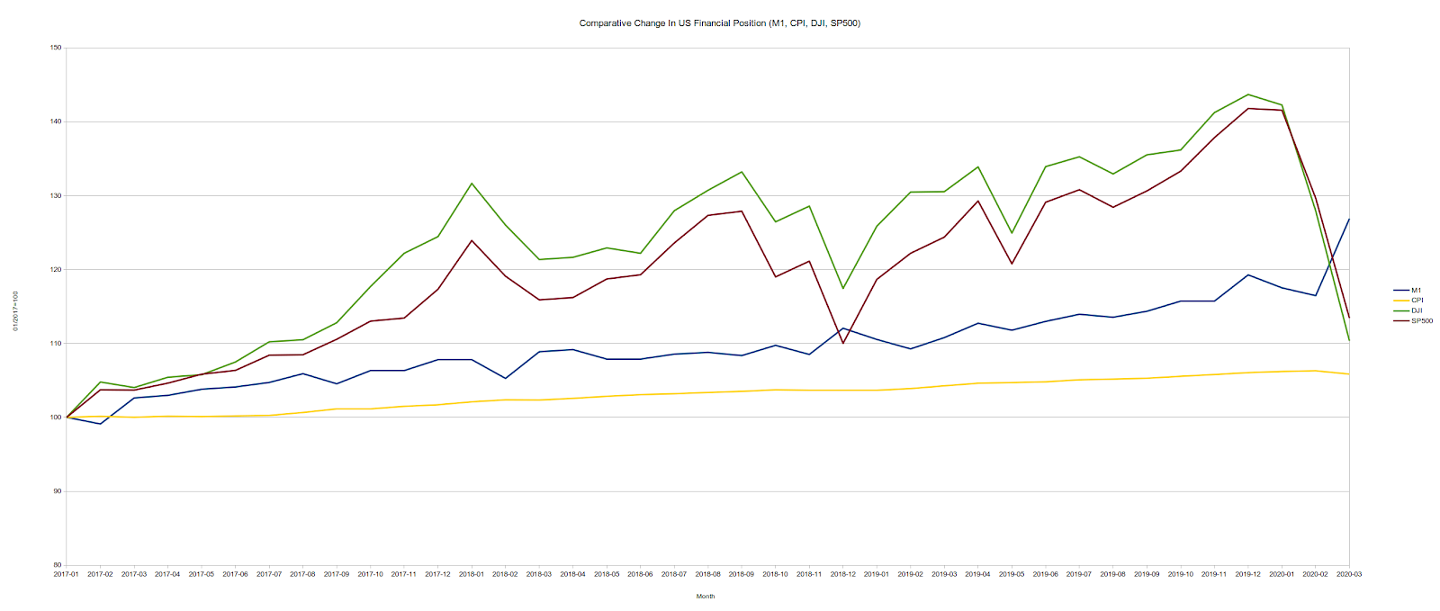
A solid trend of economic growth does not appear until very recently, as we can show by resetting the base period to 2017:

With regard to the current pandemic response, we should note here that real economic growth in the United States began to decline late last year, before the CCPVirus pandemic and the subsequent lunatic lockdowns that have devastated not just the US but the world economy.
What these charts illustrate is that, as I have concluded before, most of the "growth" in the US economy since 2008 has been largely fictional. What growth there has been is of fairly recent origin, and almost all of that has already been eliminated by the lockdown strategies imposed across most of the United States. What little wealth we had managed to accumulate since 2008 we have already squandered--and after the financial devastation that was 2008 we have, as a society, precious little real wealth to squander.
This Collapse Began In 2008
Before we can properly appreciate or apprehend the current policies of the Federal Reserve, we must first accept a grim economic reality: there never was any meaningful recovery from the Great Financial Crisis and associated "Great Recession". Far from being a period of market and economic correction, the intervening decade has been a decade of further economic distortions, further misallocations of capital, and further efforts to make permanent a decidedly irrational set of market disequilibriums. Far from the Federal Reserve having "saved" the economy, they have, under successive Fed chairpersons, perpetuated policies of economic destruction. The current economic collapse began in earnest in 2008, and has not ever really stopped.
As the initial graph of the M1 money supply makes clear, the Federal Reserve in 2008 jumped down an economic rabbit hole, dragging the rest of the US economy along with it, and has not come back up since.
Far from preserving "price stability", or even facilitating macro-economic growth, the only thing the Federal Reserve's policies have preserved is an ongoing state of economic collapse. That they have engineered quite successfully since 2008.
Until these dysfunctional policies by the Federal Reserve are ended--or better yet the Federal Reserve itself is abolished--any hope of genuine economic recovery in the United States is a pipe dream.
Given that central banks around the world largely drink the same monetary Kool Aid as the Federal Reserve, one shudders to think what this implies for the future of the global economy.
Source Data:The data sets I used were as follows:
- The historical M1 money supply data downloaded from the Federal Reserve.
- The historical monthly CPI numbers from the Bureau of Labor Statistics.
- Nominal GDP from the St Louis Federal Reserve, Seasonally Adjusted
- The Dow Jones Industrial Average stock index
- The S&P 500 stock index.

No comments :
Post a Comment
Share your thoughts -- let me know if you agree or disagree!